I started writing an article about the HSBC survey that is discussed on USNews and was pretty astonished at the reference document from HSBC.
A quote from the USNews article gives away what the study is aiming at :
"Governments cannot afford to shy away from the enormous challenges and opportunities presented by the world's aging population," says Stephen Green, CEO of HSBC.
The document that is referenced on USNews has in my opinion been selectively produced by HSBC to uphold the statement from their CEO. Being accustomed to more elaborate and detailed statistics in order to discuss subjects like this, I wasn't sure whether this study was just completely biased or presented in this manner to simplify the subject ? The very simple version referred to on USNews has three groups, North America, the US and Global (all others, or all countries combined ?). The question is obviously how simplification and objectivity cohabitate when producing documents like this.
In my initial article I had written this :
The question of “How individuals think governments should finance ageing populations (in percent)†that gives “Enforced additional private savings†coming first. Now remind me which area does HSBC provide services in ?
Now this one is a shocker, HSBC really should get a medal for figuring this one out : “Reasons for individuals wanting to work in their later years (in percent)â€. The answer that comes up first : “Need the moneyâ€. This answer scores higher in the US than anywhere else.
Not having gone further than the document referenced by USNews I was at a loss to understand the value of this type of document.
The HSBC site has a version reviewing several countries (including several European countries). When you look at this document it has statistics with charts that are not all mentioned in the one available on USNews like this one :
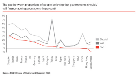

In comparison you can see that a chart from the 2005 survey (on only 10 countries) was maybe too easy to understand hence the complicated type of chart chosen in 2006 to make the numbers harder to read :
Source : HSBC Future of Retirement Research 2005

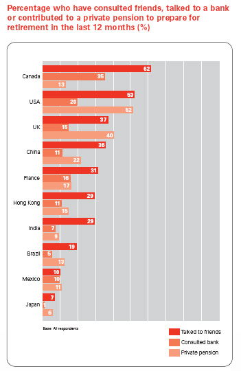
I do like the choice of red for basic gossip and the real deal, i.e. the people have taken action, is a paler shade in both cases and doesn't stand out that much. It is weird that 'talked to friends' is used as the first criteria here to rank the countries. Although using 'consulted a bank' instead would merely put France ahead of China. Note how the three countries that are considered as examples for private pensions come first and China that seems more and more like a capitalist country in disguise comes fourth.
The main pdf document on HSBC also explains the survey was conducted by Age Wave and Harris Interactive in 20 countries involving 21,329 adults aged 18 and over but doesn't indicate what the male/female ratio was.
It is very interesting to compare the two documents :
The USNews document
The Main survey report on HSBC
Also the survey is summarized per country by HSBC on their on web site http://www.hsbc.com/hsbc/retirement_future/findings
To be fair the document that is on the USNews site is most probably not intended solely for people that have had to deal with statistics at university and would explain why a simplified version like this was used. However I do feel that the process that lead to a far simpler version, is clearly subjective, towards the message HSBC wants to get across.