

I find it so frustrating when I see sites or apps that ask you to provide dates in forms, say, for example, the expiry date of something as a list of numbers and that's it. More often than not, it is really confusing.
When you're designing for lots of different people, from different countries, cultures, mother tongues/languages etc. with varying levels of digital competence, it is good to make data input as easy and as swift an experience as possible.
So, for example, a company that is often considered as a reference in UX, UI, design of user interfaces. This is what you are currently greeted with when you update a credit card to Mailchimp:

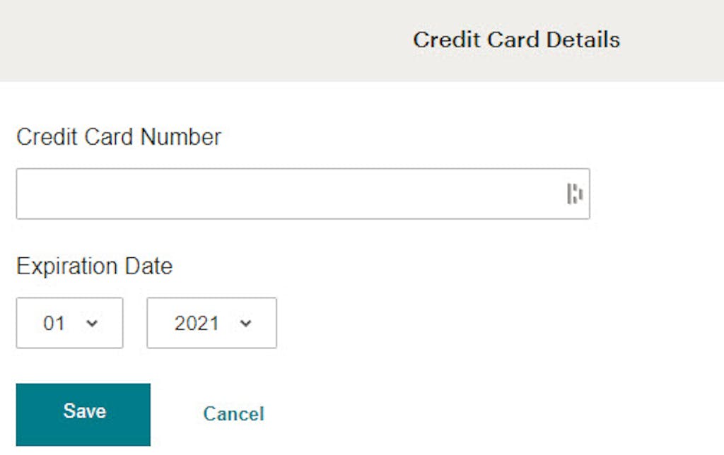
You have the months as numbers and the years as numbers, no labels and just save or cancel button, and because they already have your name (I guess that doesn't change much and using another name is an edge case) you don't have a field for that. Extra simple. It is also directly how you will read the information from your credit card, well with the exception that it is in a MM/YYYY format as opposed to the below MM/YY format used on credit cards. But by using years in the full YYYY format in the Mailchimp example, distinguishes it from the month's 2 digit format of MM. That change removes the need to say the first XX is for month and the second YY is for years. They've even forgone labels about the two fields as a result.


Now when you are being asked to provide a more personal date, say your birthday, this is where the format used is more likely to create delays and user errors.
While some people think of April as April, a lot of user interfaces expect you to think of it as 04. Not only can that lead to confusion when you are adding dates as an input because of the differences, for example, of placing the month first or second or third, depending on your country of origin. People can also get it mixed it up when choosing from drop lists even if you are just picking a number for the same reason.
I often try to use the ISO 8601 format YYYY-MM-DD (2024-03-11) with file names as it allows to order them chronologically, but depending on the country, the expected format can be very different. Here are some examples:
- Italy: DD/MM/YYYY (but sometimes yyyy/mm/dd)
- China: YYYY/MM/DD
- US: M/D/YY or M/D/YYYY(sometimes yyyy-mm-dd)
Depending on the date required or the date format in the form for 04/07/2024, a user may be providing the date: 4th July 2024 or the 7th April 2024. It seems to make more sense to find a way to distinguish the months from the days and not just rely on labels like MM / DD and expect there to be no confusion.
It is good practice to have labels visible even when the user is interacting with the interface, so avoid having labels that disappear when you click on the input field.
I prefer the approach of displaying labels for all fields.
For months (when you are using a drop list) I love the idea of a list that for the months droplist, makes both options stand out with the numbers and names of months right next to each other in the same drop list. So, for example, the month drop-down list would have:
- (01) January
- (02) February
- (03) March
- (04) April
- (05) May
- (06) June
- (07) July
- (08) August
- (09) September
- (10) October
- (11) November
- (12) December
Not everyone remembers or associates months in the same way; some will find with numbers it easy, whereas the names of months will be far easier to directly select the correct month from a list. Providing a dual approach is more likely to help both groups in quickly selecting the correct month from a droplist.
The official stance of the UK government's design pattern site is as below for memorable dates

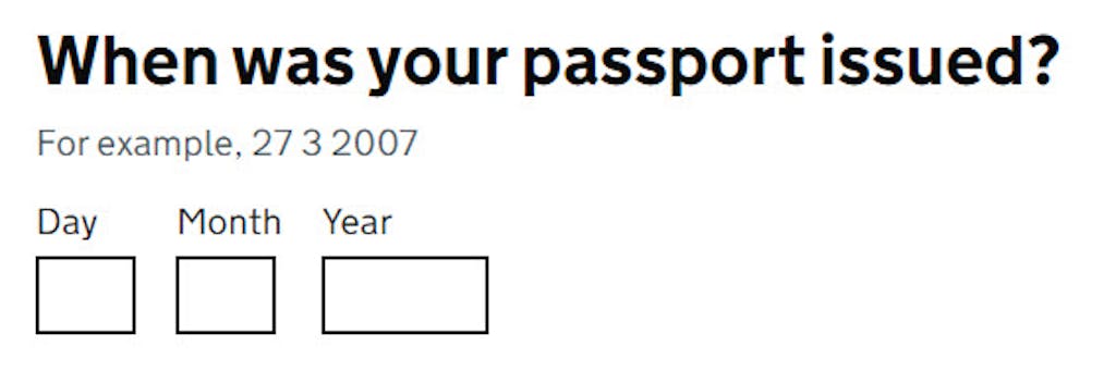
As you can see on the UK Government's site, they have a long list of date types and associated recommendations like:
- Only ask for the month and year if an approximate date is sufficient.
- Only use a calendar control if the date is close to the current date. (Otherwise scrolling or swiping can get messy with a calendar).