After having recently posted about the joke-site "don't press the red button" I was amused to discover an extremely serious experience/study over at www.dontclick.it. Yes Don't Click It, spelled the geeky way, in a domain name way.
The site is not only an experience for the creators, it's a real and novel experience for the visitors. When a trigger happy, sorry, clicker happy person comes across a site like this, it is pretty difficult to withhold the natural click instincts that have set in over the years.
As you can see here, there are little sequences that require the user to understand how to navigate the site without clicking. The sequences are very professional and well thought out. As they say in French 'chapeau' (I take my hat off to you !)...
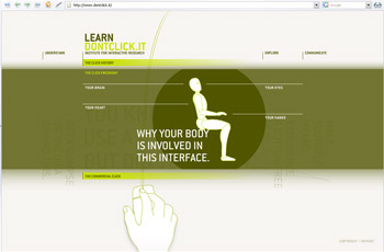
This screenshot shows how you may be asked to say whether you miss clicking :
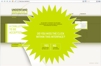
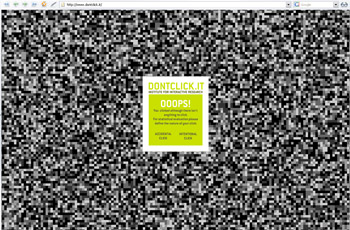
But it's all a trick, and I got caught. They ask you whether you were frustrated, not being able to use the click. So you click to say yes, and, damn you get told off, because you previously were asked not to click ! Clever, clever, this is starting to remind me of the "don't push the red button" joke (also in Flash) LOL ;). Must be a Flash sense of humour thing !
The site is really well designed, the idea is brilliant and the final product is superb. Now go take a look and let's see how good you are 🙂
Go take a look at www.dontclick.it


[...] If you enjoyed Don’t click it you’ll like this [...]