Summary: The way dates are presented, especially when you are being asked to input dates in a form can be pretty confusing if the UI lacks empathy. Some thoughts on ways to make it easier for users.
I find it so frustrating when I see sites or apps that ask you to provide dates in forms, say, for example, the expiry date of something as a list of numbers and that's it. More often than not, it is really confusing.
When you're designing for lots of different people, from different countries, cultures, mother tongues/languages etc. with varying levels of digital competence, it is good to make data input as easy and as swift an experience as possible.
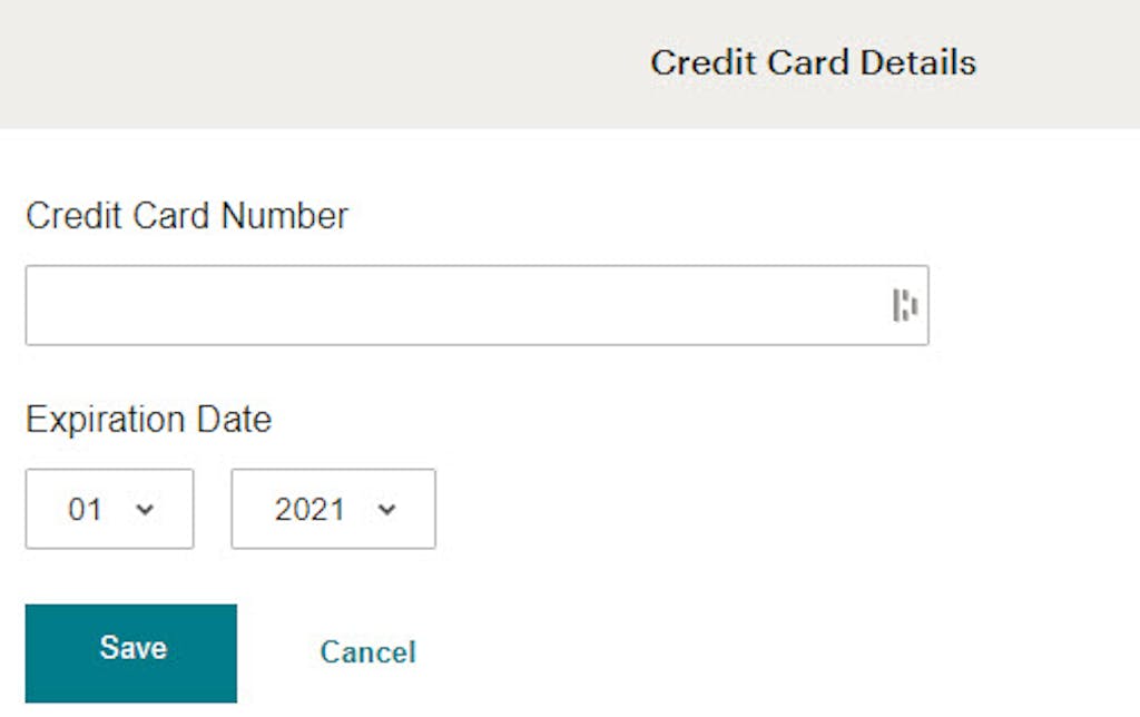
So, for example, a company that is often considered as a reference in UX, UI, design of user interfaces. This is what you are currently greeted with when you update a credit card to Mailchimp:
Mailchimp add credit card screen
You have the months as numbers and the years as numbers, no labels and just save or cancel button, and because they already have your name (I guess that doesn't change much and using another name is an edge case) you don't have a field for that. Extra simple. It is also directly how you will read the information from your credit card, well with the exception that it is in a MM/YYYY format as opposed to the below MM/YY format used on credit cards. But by using years in the full YYYY format in the Mailchimp example, distinguishes it from the month's 2 digit format of MM. That change removes the need to say the first XX is for month and the second YY is for years. They've even forgone labels about the two fields as a result.
Credit card illustration of expiry date
Now when you are being asked to provide a more personal date, say your birthday, this is where the format used is more likely to create delays and user errors.
While some people think of April as April, a lot of user interfaces expect you to think of it as 04. Not only can that lead to confusion when you are adding dates as an input because of the differences, for example, of placing the month first or second or third, depending on your country of origin. People can also get it mixed it up when choosing from drop lists even if you are just picking a number for the same reason.
I often try to use the ISO 8601 format YYYY-MM-DD (2024-03-11) with file names as it allows to order them chronologically, but depending on the country, the expected format can be very different. Here are some examples:
Italy: DD/MM/YYYY (but sometimes yyyy/mm/dd)
China: YYYY/MM/DD
US: M/D/YY or M/D/YYYY(sometimes yyyy-mm-dd)
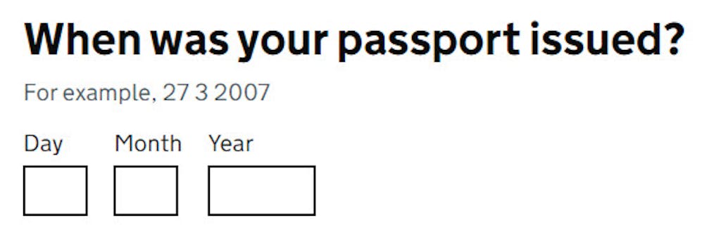
Depending on the date required or the date format in the form for 04/07/2024, a user may be providing the date: 4th July 2024 or the 7th April 2024. It seems to make more sense to find a way to distinguish the months from the days and not just rely on labels like MM / DD and expect there to be no confusion.
It is good practice to have labels visible even when the user is interacting with the interface, so avoid having labels that disappear when you click on the input field.
I prefer the approach of displaying labels for all fields.
For months (when you are using a drop list) I love the idea of a list that for the months droplist, makes both options stand out with the numbers and names of months right next to each other in the same drop list. So, for example, the month drop-down list would have:
(01) January
(02) February
(03) March
(04) April
(05) May
(06) June
(07) July
(08) August
(09) September
(10) October
(11) November
(12) December
Not everyone remembers or associates months in the same way; some will find with numbers it easy, whereas the names of months will be far easier to directly select the correct month from a list. Providing a dual approach is more likely to help both groups in quickly selecting the correct month from a droplist.
This Intermediate Guide for the ONHT (Objective, Needs, How, Trajectory) Framework transforms you from someone who uses GenAI into someone who thinks with GenAI by adding the missing cognitive functions that current GenAI lacks. The framework works through three critical pillars – Empathy (understanding all stakeholders), Critical Thinking (challenging assumptions), and Human in the Loop (active partnership). Master these patterns and you'll be solving complex problems others can't even approach, becoming indispensable by designing interactions that produce exceptional results rather than just functional outputs.
Stop getting generic AI responses. Learn the four-letter framework that transforms vague requests into precise results. The ONHT framework: Objective (what problem you're solving), Needs (key information that matters), How (the thinking approach), and Trajectory (clear steps to the answer), teaches you to think WITH AI, not through it, turning "analyse customer feedback" into board-ready insights. Real examples show how adding context and structure gets you from Level 1 basics to Level 3 mastery, where AI delivers exactly what you need.
The difference? Knowing how to ask.
GenAI tools are transforming work, but most people get poor results because they don't understand how to communicate with AI built on structured data. This guide is a series of articles that teaches the ONHT framework—a systematic approach to prompting that transforms vague requests into exceptional outputs by focusing on Objectives (what problem), Needs (what information), How (thinking approach), and Trajectory (path to solution). Master this framework and develop an expert mindset grounded in human-in-the-loop thinking, critical analysis, and empathy, and you'll excel with any AI tool, at any company, in any role.
I question the reliability and accuracy of Generative AI (GenAI) in enterprise scenarios, particularly when faced with adversarial questions, highlighting that current Large Language Models (LLMs) may be data-rich but lack in reasoning and causality. I would call for a more balanced approach to AI adoption in cases of assisting users, requiring supervision, and the need for better LLM models that can be trusted, learn, and reason.