This Intermediate Guide for the ONHT (Objective, Needs, How, Trajectory) Framework transforms you from someone who uses GenAI into someone who thinks with GenAI by adding the missing cognitive functions that current GenAI lacks. The framework works through three critical pillars – Empathy (understanding all stakeholders), Critical Thinking (challenging assumptions), and Human in the Loop (active partnership). Master these patterns and you'll be solving complex problems others can't even approach, becoming indispensable by designing interactions that produce exceptional results rather than just functional outputs.
[...] So after reading the document that explains how the Pepsi logo was created in my previous post I keep on coming across the usage of a smiley. Have you seen how it is used in the upcoming watchmen movie, as seen in the Pesi logo and now in Kraft foods logo. Is this smiley time or what? Or maybe they want us to smile in theses times of slightly unsettling times? [...]
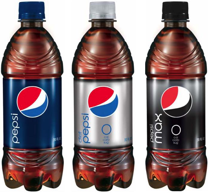
The name PEPSI is or is not THE pepsi brand equity?
The new brand identity is not forgeting the name.
I see a big risk in that move. Will it be sucessful.
I bet that the name will come back in a near future.